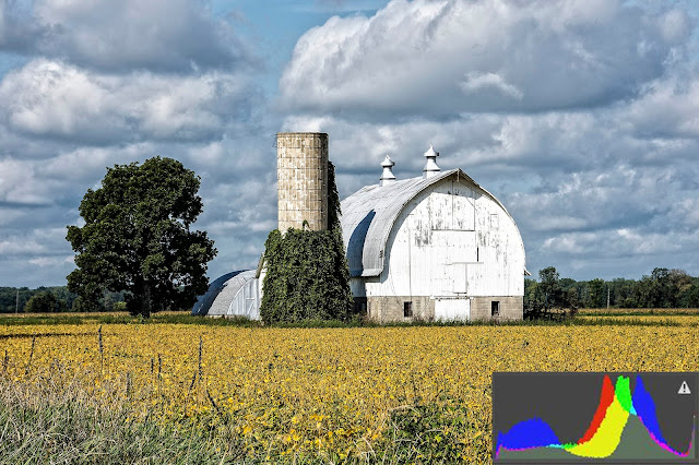
This is a barn in the Saginaw area. I was out driving around and the sunlight and sky seem to be calling me. This barn is photographed often by our Club, so it is not entirely unknown to me. I've seen many shots at different times of year. I think this has many possibilities.
First, I've started taking both RAW and JPG files. I quit taking JPGs a few years ago, but now I have plenty of disk in the camera. More information, even if it is not used ain't all that bad.
The RAW image:
The white siding is very close to being blown out. On the histogram, that is represented by indications on the right and the warning symbol. There just isn't a whole lot to deal with and the side is white so I'm expecting just a bit.
The Original Nikon JPG
By the histogram, it looks like the RGBs were reduced pretty evenly and added some dark blue.
Its OK, but not to my tastes. First the golden vegetation has real possibilities. I like yellows. But I need more definition and a touch of saturation. I think the real center of the picture is the white siding of the barn. Again, more definition of the weathering. And to finish up, the green on the tree and silo ivy is just plain boring, just some saturation. Also, if I can do something with the sky in terms of clearing up the dull blue, that will be a bonus.
Now that I'm getting very comfortable Photoshop, I'm getting a solid workflow to 'prep' the image. I start with the RAW filter. In the RAW filter, I use the Transform tool to set the overall picture horizontal and vertical elements and correct for camera distortion. Sounds busy, but I pretty much let PS do all the work.
In this case, there was some adjustment.
My next set of adjustments came from On One. I tried the NIK adjustments and nothing suited me. In On One, I used Dynamic Contrast and Grunge filters.
On One Adjustments:
Now we're starting to get somewhere. Starting at the top, the sky/clouds are starting to get some edge to them. The tress and ivy have a lighter color and you can see much more definition.The flat white on the barn side is disappearing. Not yet where I want it, but it is a start. And as a bonus, I'm seeing some definition in the roof and silo. The histogram is showing the image darkened a bit so I'll want to recover some overall light. I used the RAW filter again to bump up the yellows and greens just a bit.
The Final Image:
I think I got what I wanted. The sky has some definition, without looking too altered. The tree and ivy have more color and definition. The white barn siding isn't so bright, looks more weathered and detailed. And the gold sea looks a lot more detailed.
Continuing my practicing photos with high ISO, I headed out to Port Huron. I figured there would be plenty of action shots between the boats and the birds. I shot many images of boats going from 'no wake' to wide open and could follow/pan pretty easily with the 200 mm lens. I had lots of luck with clarity and had many more good shots than bad. It was a good beginning.
Shooting the birds in flight was a bit more difficult. They did not get the memo to fly close to me and in a direction I could use. At least none of them crapped on me.
I did see some of them guarding the lights, and with the mix of blue sky and white puffys, there were some opportunities.
I wanted to shoot at ISO 1000 but I was using a polarizer, so bumped it down to 800. With that set up, I had a shutter speed of 1/640. I always use a polarizer around the water.
What I learned. I've shot (photographically) a number of Gulls. There is definition in the chest feathers. On this shot, there is no definition. Like he's wearing a T-shirt. I'm going to take it that in the RAW image with enough time I might be able to bring something out - but I'm OK with this as it is. There is a lot of white between the Gull, the lamp and the clouds. All of it is nice and defined.
The final product is cropped pretty tight, if i was going to do something more with this image I might have to take a different approach.
Shutter: 1/640
Aperture: F/11
ISO: 800
Mode: Manual
Focal Length: 135 mm
Polarizer
My next big photo op is roughly one year away. I am heading west with a few friends to attend the Reno airshow. As in Reno, Nevada. Wow, I have some work to do!
First, this takes me a bit out of my element. I like nice static subjects. If I miss it, I can go back. I'm not much for one and dones.
I've been looking at web sites for aviation photography and a few things I've learned. One is I'll need to go shopping for something more powerful than my 200mm lens. Doable.
I'll also need to be able to take shots at 1/2000. The guideline for taking photos of prop driven aircraft is 1/40 to 1/125. The blur of the prop makes the shot. But for jets and very distant shots with longer focal distances, the higher speeds are essential.
One option to achieving higher speeds is to open up the lens' F/stop. I'm real comfortable at F11. I'll go to F/8 if I need to but that's about my limit.
Another option is to increase the ISO. Being brought up in the 35mm days, 100, 400 and 800 are my familiar numbers. The advertising on my D7200 says I should be able to get up to 1600 without too much issue.
OK, let's find out.
I've seen a number of sites that demo ISO noise effects. Mostly the changes are in the area of color and definition, plus the introduction of 'noise'. I should be able to compensate for definition to keep away from a really soft look. I should be able to saturate as necessary for color. The noise? We'll have to see.
Now what I really need is a subject. And as luck would have it, the snowmobile races that I went to last year - were going on today. This is as close to air races as I'm going to get today.
To get where I want to go, I'm using Manual Mode. I have the lens set at F11 and the speed at 1/1000. I took a few evaluation shots and found that when shooting in the sunlight, 1/1250 painted a very nice histogram. With a year to prep, I have one data point.
ISO 1,000
Speed 1/1250
Aperture F11
Mode Manual
Focal Length 27mm
(Just in case you missed it before.)
The JPG that Nikon created was OK. On the RAW image, which is the one above, all I did was let Photoshop add some depth and I added just a bit of green saturation for the grass.
First test passed. I think the image is fine. Next test - will the D90 do as well? (It's going out west too!)
I spent time today talking with two of my fellow photo-club members and as usual we wound up on the subject of workflow processes.
We started talking about the software we used. We all had NIK software mostly because it is now free to use. Thank you Google. The software also works well with Photoshop and Lightroom.
In using NIK, one of the tips I picked up was to use a bleach filter early on in the process. A bleach filter will do what bleach does - remove a lot of color. Clean up the stains. The filter will also sharpen and tone compress a lot of the photo. In my limited experience (this afternoon) the filter seems to do a much cleaner job of sharpening and compression. In the process, you can add color back - and the color stays where you want it - that is no compression halos.
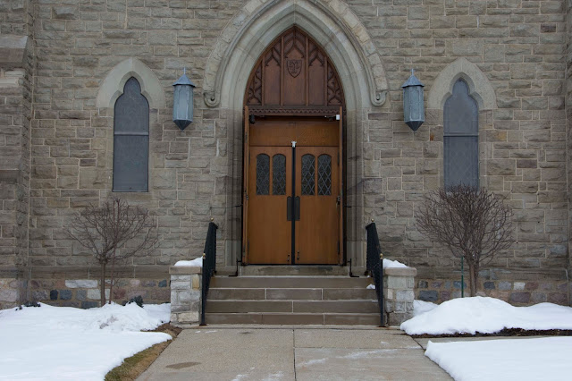
For my testing purposes, I'm using a photo of a church door I shot earlier this year in Flint. Nothing reacts better to tonal compression that rock/stone and wood.
This is the original RAW image.
The image is about as sharp as it will get naturally, I used a tripod. As with RAW images, this is a bit flat and dull. This is what the camera sees before going through some Nikon processing to make it a bit more pleasing to the eye. This is the starting point.
My first step is to use the RAW editor to use the camera correction to straighten the image and lighten it up a bit.
In the next step or layer, I will add the bleach filter.
As with bleach, it has removed what looks like a layer of color. Looking at the door in the center, you can now see wood grain definition. The masonry looks like a sharpening effect was used, but was much easier than trying to find that right amount.
Next step will be to add some color back in with the Brilliance/Warming filter.
I like the way the color of the door has started to return. When the new door lays is compared to the pre-bleach layer - you can tell the difference.
With a lot of work, I might be able to get the same result using multiple filters. With this flow, there is no halo and the wood grain and masonry grain really pop.
I usually don't use - or haven't thought much of using this next filter, but for this photo it works. The filter adds a bit lo light to the center. it is basically the same as a vignette, but more of a circular pattern. And in this case, I just want to accentuate the doors and this does the trick nicely.
So I now have the door where I want it color-wise and relatively speaking. I'm on the final stretch here. And because it is me, I need to add an HDR effect.
Now I've got the HDR effect I like. The color is really close but going to give it just a little warm boost.
Clearly that last add of a warm is personal.
This is the final product up against the original.
If I was going to do more, I'd clean up the snow. The HDR processing doesn't really do snow any favors, I like the pure white that is in the original. I'd use masking to fix the snow. That's about it for this image.
For this purpose, I like using the bleach filter. That allows me to keep the sharpness of the photo through other adjustment layers.


