A very good friend of mine suggested I invest some time in finding and using Photomatix presets. He's been using Photomatix for a number of years and he'd found the ones that came with the application sort of cramped his style. I immediately downloaded the set he suggested. And it all worked out. For a while. Then the machine crashed.
Photomatix makes it very easy to load presets. What they don't do is make it easy to manage or delete any of the presets that are loaded.
I loaded some presets on the new PC - and found the naming convention was not to my liking. That's right, the naming convention irritated me. And that's not a way to stay on the new machine.
Google deleting presets in Photomatix - good luck.
It took some digging, but the presets are loaded into a hidden directory. But once you are in the directory, any adds/deletes/changes are real time.
(And this is for Winders - Mac users can drift off now.)
First you must show hidden files and directories in your view. The directory path is C:\Users\(Your Name Here)\AppData\Roaming\HDRsoft\PhotomatixPro\Presets\
The AppData folder is hidden by default.
If you do download presets - which you should - you can manage effectively in this directory.
Monday, December 7, 2015
Sunday, November 29, 2015
Step Water Falls - Lesson Learned
With my late summer interest in waterfalls - I had great vision how this would turn out. In the end, I need to go back.
But not to lose the photo - or a learning opportunity - I decided to see what the difference is between a 1 shot HDR effect and a 3 shot HDR involving the motion of water.
I like to have the option with the water movement. The shot was set up on the slow side. Tripod for sure.
This is the basic shot.

1/30 f/22
EV 0.0
Aperture Priority
ISO 200
Focal Length 32 mm
For the associated HDR bracket, I use EV values of +2 and -2.
Going back and doing it over again, I'd go with a faster speed. There are no DOF issues or concerns. Lesson learned - and a reason to go back.
This a composite of the 1 and 3 shots.
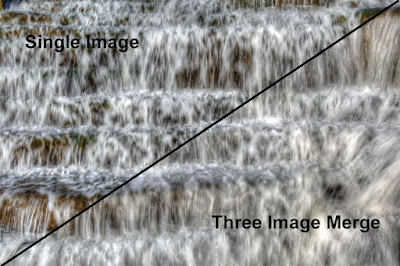
And so if I were going to work on a shot for this, I might go in this direction. I'd use the single shot. I'd try to pull out some of the greens and sharpen it up a bit.
I think the better plan would be to shoot with a higher speed, and let the 3 image merger get the effect of the moving water.
But not to lose the photo - or a learning opportunity - I decided to see what the difference is between a 1 shot HDR effect and a 3 shot HDR involving the motion of water.
I like to have the option with the water movement. The shot was set up on the slow side. Tripod for sure.
This is the basic shot.

1/30 f/22
EV 0.0
Aperture Priority
ISO 200
Focal Length 32 mm
For the associated HDR bracket, I use EV values of +2 and -2.
Going back and doing it over again, I'd go with a faster speed. There are no DOF issues or concerns. Lesson learned - and a reason to go back.
This a composite of the 1 and 3 shots.

And so if I were going to work on a shot for this, I might go in this direction. I'd use the single shot. I'd try to pull out some of the greens and sharpen it up a bit.

I think the better plan would be to shoot with a higher speed, and let the 3 image merger get the effect of the moving water.
Computer Crash - Yikes!
It was bound to happen.
The ol' XPS420 went for 8 strong years. I'm guessing it was the power supply that went out. I've been able to get data off of the hard drive and it still moves. (How that is done is another story.)
The good news is that without the hard drive access, I didn't lose any files or data. The backup plan was solid. (It should be, that's what I do for a living. Would have been a real problem if I was missing something.)
About 2 years ago, I bought a WD 3 TB My Cloud. This sits on the home network versus previous WD devices that attached directly to the PC. It is accessible to all the PCs in the house. File access is almost as fast as on the local drive. Best addition to the house in a long time. That is the backbone of my backup system. I've been using the WD backup program for years - and it has always been rock solid.
Back to the crash, I could probably get out of this with a new power supply. But that is not what I do best. I pulled the hard drive out of the case, and it had 2008 on the label. Good drive, been spinning almost constantly since purchase. I can't complain. Started on Vista, upgraded to W7 and finally to W10.
But spending $100 to fix an 8 year old unit is not what I do best - especially if I see it as a sign from the tea leaves that I need to upgrade my rig. Who am I to stand in the way of that vision?
I've been designing my next system over the last few days. In the past I've always gone to Dell. And I've liked the products that I've purchased from them. This time, I'm going the design my own route. For what I was going to spend with Dell, I can build a much better system. I was actually going to build my own - but the store I'm dealing with is charging me virtually a few peanuts to build, let them do it. I'll have time when I'm retired.
We're still nailing down the details, but looks like a 6th gen I5 processor for horse power and a combo of a solid state drive and spinning disk for storage. I'll go with 16 gig memory. The rest is just details. Should be enough to work on a few photos?
I'm currently working on a laptop that I bought for C - and it didn't quite work out. It has 4th Gen i5 processor. Works OK - but I'd get frustrated if I used this as a primary work machine. It has 6 gig of memory - and that might be slowing me down a bit as well. It is not all bad - it is a great life boat.
I'll probably get the new machine this week. I promised C next weekend we're doing the Christmas Cards.
Saturday, October 31, 2015
Aircraft (B24) Wheel
On the day when there were WWII aircraft in Flint, I tried to get not only total whole aircraft photos, but components as well. I focused on Engines, Internal Tubing and such. One of the components was tire and wheels. This one is from the B24.
Warning: This is more of a study in processing and workflow for me. Plus, my new version of On One's software arrived yesterday - and I needed to play with it.
With this photo, I wanted to split the processing to two elements. I wanted the tires - and then everything else. In the end, I didn't wind up with too much separation from the original. Again, this is more of a study effort.
This is the original RAW image.

1/400 f/9
EV 0.0
Aperture Priority
ISO 400
Focal Length 48 mm
My intention is to lighten up the silver/white ares of the strut and wheel while trying to keep the tire dark. And of course, add some HDR effects.
The first step is to pass it through he HDR software to get a base look of what I like. I'm going with a little overall saturation and sharpening.

I have the inner wheel and two red pins much closer to where I'd like them. The tire is nowhere close to what I'd like to see, so that has to get changed.
On my base layer, I will darken the entire layer. I'm concentrating on the tire only.

I've moved the histogram a bit to the left. The tire is a bit more where I want it to be. The next step is to get the strut and wheel back in. For this, I masked out the tire on a layer.

I'm keeping the from the original HDR image. When the two are merged together, this is the result.

I now have an image to make some subtle changes on. I'll add some light HDR effects, sharpening and push the reds a bit to get the pin color to stand out without saturation the whole image. I also tried something else and that is not using the full opacity of the adjustment layer, just used 75% over the original image. Little attempt to dial it back some.
This would be the final image.

For a presentation image, I'm going to crop it a bit more than normal for me. I'd like to center the strut and make the tire symmetrical. I'd like all tire on the corners.

Monday, October 26, 2015
Stepping Stone Falls
In spite of what you might think because I live near Flint, we really do have some nice areas. We have a wonderful county park system along the Flint River. One of these areas is called Stepping Stone Falls. Realistically, it is a dam. What makes this interesting is the dam spillway is done in a series of stairs. It is unique as far as I know.
I do like photographs of waterfalls, large and small. The study of water and motion can be expressed in many ways. Water shot fast and slow can be interesting in its own way.
Here is the first of what will be more than a few shots from the day. This will show about 2/3s of the spillway.

1/50 f/22
EV -2.0
Aperture Priority
ISO 200
Focal Length 18 mm
Focal Length (35 mm) 27 mm
Being is was a fairly dark environment, I'm going to try to keep the final product dark as well. But I want to make the water stand out - mostly white.
There are also some trees just over the top of the wall that are a bit distracting to me. They have to go. I'd like to keep the sky - it has real character and should look interesting with HDR processing. I'm going to try something new to get the look over the wall.
This is the photo with neutral HDR processing.

I like what HDR sharpening will do for the concrete, and I'd like to keep that in mind. The shot at f/22 really had the depth of field sharp all the way through which is a big help. I can tell for me to get the look I want, the far waterfall is going to need some help.
In this step, I really want to remove the trees from the top of the far wall. What I'm going to try is using two image layers. I will mask out the sky and trees on the top layer. I will stretch the bottom layer down and as a result the trees will drop behind the wall of the top layer. Spoiler Alert: It all worked, in the final image there are no trees.

I like with is going to happen with this. But I got a bit of an unexpected surprise. I started to notice a few blemishes. Sure enough, looking at my UV filter I had some small water spots. Note to self, when working near moving water some will wind up where it is not supposed to be. Take a cleaning cloth with you. Easy to remove with most programs. After cleaning this up a bit, this is the image I will use. In my post processing, I used two layers of this to remove the trees at the top of the cement walls as explained earlier. Again, I think most post processing applications can do what I did. I also noticed there was some chromatic aberrations on the center and left of the image. I used my new application to remove the CA in the center. The CA on the left will have to be cropped out. And that will not alter what I have in mind for this at all.
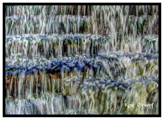
The final image to work with is this:

The final crop will take care of the wall on the right. I'll also crop out the stairs on the left so there won't be anything left to the imagination.

This is a bit darker that what I normally like. In this case I like it. The day was no gem to work with - so the final image should be dark as well.
I do like photographs of waterfalls, large and small. The study of water and motion can be expressed in many ways. Water shot fast and slow can be interesting in its own way.
Here is the first of what will be more than a few shots from the day. This will show about 2/3s of the spillway.

1/50 f/22
EV -2.0
Aperture Priority
ISO 200
Focal Length 18 mm
Focal Length (35 mm) 27 mm
Being is was a fairly dark environment, I'm going to try to keep the final product dark as well. But I want to make the water stand out - mostly white.
There are also some trees just over the top of the wall that are a bit distracting to me. They have to go. I'd like to keep the sky - it has real character and should look interesting with HDR processing. I'm going to try something new to get the look over the wall.
This is the photo with neutral HDR processing.

I like what HDR sharpening will do for the concrete, and I'd like to keep that in mind. The shot at f/22 really had the depth of field sharp all the way through which is a big help. I can tell for me to get the look I want, the far waterfall is going to need some help.
In this step, I really want to remove the trees from the top of the far wall. What I'm going to try is using two image layers. I will mask out the sky and trees on the top layer. I will stretch the bottom layer down and as a result the trees will drop behind the wall of the top layer. Spoiler Alert: It all worked, in the final image there are no trees.

I like with is going to happen with this. But I got a bit of an unexpected surprise. I started to notice a few blemishes. Sure enough, looking at my UV filter I had some small water spots. Note to self, when working near moving water some will wind up where it is not supposed to be. Take a cleaning cloth with you. Easy to remove with most programs. After cleaning this up a bit, this is the image I will use. In my post processing, I used two layers of this to remove the trees at the top of the cement walls as explained earlier. Again, I think most post processing applications can do what I did. I also noticed there was some chromatic aberrations on the center and left of the image. I used my new application to remove the CA in the center. The CA on the left will have to be cropped out. And that will not alter what I have in mind for this at all.
The final image to work with is this:

The final crop will take care of the wall on the right. I'll also crop out the stairs on the left so there won't be anything left to the imagination.

This is a bit darker that what I normally like. In this case I like it. The day was no gem to work with - so the final image should be dark as well.
Wednesday, October 21, 2015
Windows 10 Upgrade
I upgraded my photo support PCs to Windows 10 over the last two days. The upgrades went well. On my laptop with not much on it, the upgrade was fast and no issues. To be fair, I had done a re-image of the factory delivery only a few weeks ago. So it was as clean as could be. On my primary PC, there were a few issues. Most I could work through. One caused me to call MS support and that was a waste of time. It had to do with home groups not working - and their solution was to load Windows 10 on a third laptop in the group. Eventually found the solution - and it wasn't that difficult and all are working as expected.
Tuesday, October 20, 2015
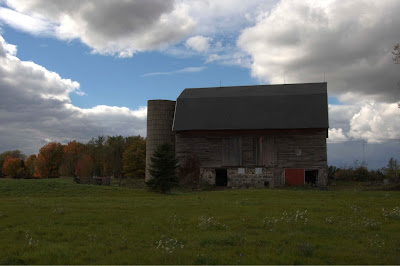
Michigan Barn in Fall - 2015
With the 2015 fall viewing season just about over, I had to get out this past weekend and see the sights. Without a doubt, fall is my favorite few weeks of the year. Michigan, like southwestern Pennsylvania is abundant with color. I took a ride, with no particular destination in mind. As the weather in Michigan goes, I hit most everything including sun, wind, rain and snow. Aside from leaves and the colors, I was also looking at farm barns. My photograph of a barn in Pennsylvania on a recent road trip (here) has shown me the fun of this subject. One of my early favorites is that of a barn in Pennsylvania close to Ligonier. I'll have to resurrect that image.
I found this barn structure close to the road and spent some time there. As I am respectful of the property, I couldn't get real close. There is a little evergreen tree in the front area that really keeps this from being a special image. But other than that - has good stuff.
As I progress through my workflow, I apply a number of 'changes' to see what strikes me as something I want to work with. In this case, I really liked what over sharpening would do. So here is the direction I went with.
Here is the original RAW image:

1/125 f/25
EV -3.0
Aperture Priority
ISO 200
Focal Length 31mm
Focal Length (35 mm) 46 mm
The EV of -3 really gives a dark image - but there is no light lost. I can work with this. Since I don't use Nikon's JPG algorithms, the closest I can get is something along these lines as to what a photograph shot with the AUTO setting would be.

In order to put this together, I will have to make a few 'improvements.
1. I know from experience that there will be a halo effect between the barn and sky. I will need to find a sky that is similar and adjust it with the same settings that I have done with the barn, trees and grass. But knowing that from the beginning will save me some time. I won't need to remove the power lines and associated equipment on the right.
2. Bringing in a new sky also presents a few issues with merging and the tree tops. I will even the leave canopy so the leaves will look fuller.
3. There is a white horizontal 'something' that I'm sure is functional for the farm - but not so much for me. That has to go.
4. There is a white window between the green tree and the black (Open) door. Sure it belongs there, but in the end it will be distraction. That has to go as well. I will make the small tree a bit fuller as well to remove that distraction.
With the above edits done, this is what I get.
I now have something that I can put through the HDR program. My original thought was to go for a sharp grunge image, really pull out the definition of the barn - and slightly over-saturate the colors. Sounded good, but in practice didn't turn out so well. Probably photo creep - just kept adding until it wasn't what I wanted. So I dialed it back a little. Got the colors and light right in the HDR program and will do the rest later. This is what I have after tone mapping.

There is going to be some halo effect around the barn. Not much I can do with it. What I did do (correctly) is took a photo if the sky while I was there, just in case a sky substitution was gong to be required. And it will be. This is the sky I will use. I ran it through the HDR using the same setting as I did with the barn. This is what I will use.

With the two combined, this is what I have coming out of tone mapping - and ready for the final edits. The final edits included some fall coloring for the trees and a bit of green coloring for the grass. And a lot of sharpening. (Finally got the overall look!)

There it is. In the final cropping, I will cut out most of the right side and some of the grass.
The final image:

I found this barn structure close to the road and spent some time there. As I am respectful of the property, I couldn't get real close. There is a little evergreen tree in the front area that really keeps this from being a special image. But other than that - has good stuff.
As I progress through my workflow, I apply a number of 'changes' to see what strikes me as something I want to work with. In this case, I really liked what over sharpening would do. So here is the direction I went with.
Here is the original RAW image:

1/125 f/25
EV -3.0
Aperture Priority
ISO 200
Focal Length 31mm
Focal Length (35 mm) 46 mm
The EV of -3 really gives a dark image - but there is no light lost. I can work with this. Since I don't use Nikon's JPG algorithms, the closest I can get is something along these lines as to what a photograph shot with the AUTO setting would be.

In order to put this together, I will have to make a few 'improvements.
1. I know from experience that there will be a halo effect between the barn and sky. I will need to find a sky that is similar and adjust it with the same settings that I have done with the barn, trees and grass. But knowing that from the beginning will save me some time. I won't need to remove the power lines and associated equipment on the right.
2. Bringing in a new sky also presents a few issues with merging and the tree tops. I will even the leave canopy so the leaves will look fuller.
3. There is a white horizontal 'something' that I'm sure is functional for the farm - but not so much for me. That has to go.
4. There is a white window between the green tree and the black (Open) door. Sure it belongs there, but in the end it will be distraction. That has to go as well. I will make the small tree a bit fuller as well to remove that distraction.
With the above edits done, this is what I get.

I now have something that I can put through the HDR program. My original thought was to go for a sharp grunge image, really pull out the definition of the barn - and slightly over-saturate the colors. Sounded good, but in practice didn't turn out so well. Probably photo creep - just kept adding until it wasn't what I wanted. So I dialed it back a little. Got the colors and light right in the HDR program and will do the rest later. This is what I have after tone mapping.

There is going to be some halo effect around the barn. Not much I can do with it. What I did do (correctly) is took a photo if the sky while I was there, just in case a sky substitution was gong to be required. And it will be. This is the sky I will use. I ran it through the HDR using the same setting as I did with the barn. This is what I will use.

With the two combined, this is what I have coming out of tone mapping - and ready for the final edits. The final edits included some fall coloring for the trees and a bit of green coloring for the grass. And a lot of sharpening. (Finally got the overall look!)

There it is. In the final cropping, I will cut out most of the right side and some of the grass.
The final image:

Friday, October 16, 2015
Cape Neddick (Nubble) Lighthouse - 2015
This is almost a re-do of a post from 2010 of the Cape Neddick Lighthouse in Maine. Here is the original post. This is not quite the same photo, but is the same angle - an just more of the overall environment. My re-do won't go far in a competition, it has one fatal flaw. The white color off of the house and side of the light is almost too much. Every photo should have some white - in this case that's too much.
But this effort was to learn a few things. I wanted to see if the removal of larger objects would negatively impact what tone compression does to a photo. I've removed small objects before, but in this one I'm going for what I would call more major restoration of an area.
I also have a version of what Nikon would do with my image. I quit doing the Nikon JPG thing some time ago, this could be interesting.
So here is the original Nikon image:

From the histogram, you can see what Nikon is doing to this image. Centering the light. I'm certainly not complaining or criticizing. Just another reason to do what we do.
Below is the RAW image. On this image, I've pointed out some distractions that really should be removed. And this is the point of this exercise.
On the left side in the center, there is a power line and some other equipment. The power line runs to the house. To me that is distracting. There is also a small flood light just to the right of the light tower. That too has to go. And lastly, there is an orange lobster trap buoy just above the rocks in the water. If the buoy was in the middle of the waterway, I might leave it, but the subject is the lighthouse. It must go as well. This is the RAW image - with the objects to be removed listed.


I tried different methods, both erasing with the application filling in the areas and clone stamping. I went with the clone stamping on all removals. Seems to take a little more time but works out better when done.
Next I put this image through the HDR processing. In the original posting, I was going through my 'grunge' phase. Now I favor a bit more realistic scene and that's what I'm aiming for now. Here is the image with tone compression.

My overall light is spread out across the colors - and I like that. There are no tell tale halos that I need to address, and I like that more.
My final touches are to add a bit more green to the vegetation, darken the sky a bit and warm the image up just a bit. And this would be the final image:

From the original Nikon JPG, I have better detail in the rocks close to the water and better greens on the hill.
And finally, with my size for the blog and signature block:

But this effort was to learn a few things. I wanted to see if the removal of larger objects would negatively impact what tone compression does to a photo. I've removed small objects before, but in this one I'm going for what I would call more major restoration of an area.
I also have a version of what Nikon would do with my image. I quit doing the Nikon JPG thing some time ago, this could be interesting.
So here is the original Nikon image:

From the histogram, you can see what Nikon is doing to this image. Centering the light. I'm certainly not complaining or criticizing. Just another reason to do what we do.
Below is the RAW image. On this image, I've pointed out some distractions that really should be removed. And this is the point of this exercise.
On the left side in the center, there is a power line and some other equipment. The power line runs to the house. To me that is distracting. There is also a small flood light just to the right of the light tower. That too has to go. And lastly, there is an orange lobster trap buoy just above the rocks in the water. If the buoy was in the middle of the waterway, I might leave it, but the subject is the lighthouse. It must go as well. This is the RAW image - with the objects to be removed listed.

Here you can really tell what Nikon did when processing the RAW image to a JPG. The process moved the light to the left and highlighter the reds to match the greens and blues.
So I removed the items called out above - and this is what I have.

I tried different methods, both erasing with the application filling in the areas and clone stamping. I went with the clone stamping on all removals. Seems to take a little more time but works out better when done.
Next I put this image through the HDR processing. In the original posting, I was going through my 'grunge' phase. Now I favor a bit more realistic scene and that's what I'm aiming for now. Here is the image with tone compression.

My overall light is spread out across the colors - and I like that. There are no tell tale halos that I need to address, and I like that more.
My final touches are to add a bit more green to the vegetation, darken the sky a bit and warm the image up just a bit. And this would be the final image:

From the original Nikon JPG, I have better detail in the rocks close to the water and better greens on the hill.
And finally, with my size for the blog and signature block:

Saturday, October 10, 2015
Fall 2015 - Walking Bridge
After a week of not seeing the sun - what a beautiful Saturday! Spent most of the day walking the local parks, looking at leaves and playing with camera settings.
One of the parks has a walking bridge over the Flint River. This is a tough place to shoot, lots of shadows and physically tough angles. And it is a popular place, lots of traffic.
But once you get there, the payoff can be good.
Here is the original raw image:

And the histogram:
 1/40 f/9
Aperture Priority
ISO 200
Polarizer Filter
Focal Length 24mm
Focal Length (35 mm) 36 mm
Overall the lighting is about where I like it - nothing blown out on the lights or darks. I used a polarizer filter because as a general rule anytime I'm around water I use it. The polarizer also really brings out the blues of the sky. Being that it is a fall season photo, the tree colors are the wild west as to what can be done.
The bridge is the tough part - really dark. I know the colors are there, just have to get them. To get the detail and light of the bridge, I used Elements raw editor. I created two additional images with an EV of +2 and +4. These are the images:
+2:

+4:

In the +4 image, there is really good detail in the bridge. I took the original image, plus these two and pushed them through my HDR software. (My plan B was to use the +4, but I do like the detail the HDR processing does and in this case it worked.)
This is what I pulled from the HDR software.:

I don't really care about any of the other objects or colors - bridge only. I will use this as my first visible layer and place the image with all the other objects processed the way I like then over top if this image. And I removed the bridge.

And when all the processing is completed - This is it.

All in all it works well for me. Still a bit on the dark side, but that was the environment in the trees.Good walk for the day - and a good memory.
One of the parks has a walking bridge over the Flint River. This is a tough place to shoot, lots of shadows and physically tough angles. And it is a popular place, lots of traffic.
But once you get there, the payoff can be good.
Here is the original raw image:

And the histogram:
Aperture Priority
ISO 200
Polarizer Filter
Focal Length 24mm
Focal Length (35 mm) 36 mm
Overall the lighting is about where I like it - nothing blown out on the lights or darks. I used a polarizer filter because as a general rule anytime I'm around water I use it. The polarizer also really brings out the blues of the sky. Being that it is a fall season photo, the tree colors are the wild west as to what can be done.
The bridge is the tough part - really dark. I know the colors are there, just have to get them. To get the detail and light of the bridge, I used Elements raw editor. I created two additional images with an EV of +2 and +4. These are the images:
+2:

+4:

In the +4 image, there is really good detail in the bridge. I took the original image, plus these two and pushed them through my HDR software. (My plan B was to use the +4, but I do like the detail the HDR processing does and in this case it worked.)
This is what I pulled from the HDR software.:

I don't really care about any of the other objects or colors - bridge only. I will use this as my first visible layer and place the image with all the other objects processed the way I like then over top if this image. And I removed the bridge.

And when all the processing is completed - This is it.

All in all it works well for me. Still a bit on the dark side, but that was the environment in the trees.Good walk for the day - and a good memory.
Friday, October 9, 2015
Chromatic Aberrations - Subtle Photo Killer
Chromatic Aberrations are the pesky colors that border objects in your photo.

Technically, what is it? Chromatic Aberration is a common optical problem that occurs when a lens is either unable to bring all wavelengths of color to the same focal plane, and/or when wavelengths of color are focused at different positions in the focal plane. Chromatic aberration is caused by lens dispersion, with different colors of light travelling at different speeds while passing through a lens. More technical explanations can be found here.
So what to do? Google of course. In the upper end edit programs there are options to reduce the effects of CA. I found a nice little program as an alternative for low cost that worked as advertised. The program is PTLens. There is a trial time for 10 images. I picked my barn picture which had a lot of distortion between the building and sky - and I didn't notice but a lot of red in the foliage on both the right and left. I followed the directions and it worked great! I now have another tool for the tool box.
The before and afters:
With the Chromatic Aberration.
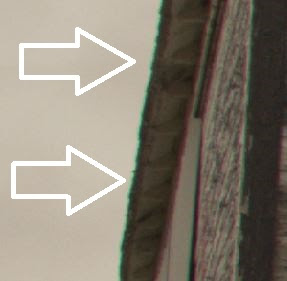
Since the CA is caused at the time the image is taken, early removal would probably be best. In my barn photo, the CA on the barn didn't show up until I put it on a monitor as a screen saver. The it was painful. If that photo is going to go into a competition, I can't take that chance. One of those things that if it is not there, you'll never know, but leave it in there and .......
Technically, what is it? Chromatic Aberration is a common optical problem that occurs when a lens is either unable to bring all wavelengths of color to the same focal plane, and/or when wavelengths of color are focused at different positions in the focal plane. Chromatic aberration is caused by lens dispersion, with different colors of light travelling at different speeds while passing through a lens. More technical explanations can be found here.
So what to do? Google of course. In the upper end edit programs there are options to reduce the effects of CA. I found a nice little program as an alternative for low cost that worked as advertised. The program is PTLens. There is a trial time for 10 images. I picked my barn picture which had a lot of distortion between the building and sky - and I didn't notice but a lot of red in the foliage on both the right and left. I followed the directions and it worked great! I now have another tool for the tool box.
The before and afters:
With the Chromatic Aberration.

With the Chromatic Aberration removed.

Since the CA is caused at the time the image is taken, early removal would probably be best. In my barn photo, the CA on the barn didn't show up until I put it on a monitor as a screen saver. The it was painful. If that photo is going to go into a competition, I can't take that chance. One of those things that if it is not there, you'll never know, but leave it in there and .......
Wednesday, October 7, 2015
Rockland Breakwater Light - 2015 Edition
In the high school graduation time of year, 2010, I had the chance to explore the Maine coast and some of the light houses. This is the Rockland Breakwater Light. The light sits at the end of a long jetty. When I was there, it was a crappy, cold, windy and rainy day. But even in those conditions, it had a beauty of its own.
I liked playing with this photograph because with a little effort, the sky will not be flat and the water has some definition.
The original post can be found here: Previous Post.
The Original Post Image:

Generally, overall I like what was done with the image. I like everything except the halo in the sky between the house structure and the sky. So in 2015, I should be able to come up with something where the halo is non-existent.
The original base of this image is a combination of two photographs. In each of the two photographs, there is an imperfection (unwanted human) that I didn't want in the final product. The two photographs were fairly similar with respect to the position of the structure and took just a small amount of adjusting to line up. The two original images are:


I've circled the objects that need to be removed. I used the top image as the primary image. I put the bottom image underneath the top image. After I lined the two up, I used a masking brush to remove the unwanted object at the top of the stairs. Everything around that area lined up perfectly. I now had my base image to work with.

My plan was to put this through Photomatix and concentrate on everything but the sky. Experience tells me that the sky is where most of the halo caused by tone compression will occur. I'd like to keep the sky, but it doesn't do the day justice. It was much darker. This is what Nikon think the image should look like - and why you should take Nikon out of the equation by shooting in RAW. Here is what I have after tone mapping with Photomatix.

I didn't have to do too much with this, but I did get great colors on the water, jetty and the building. There is still too much halo in the sky - and it is too light for what I want. The sky must go! The sky colors are fairly consistent making for easy removal. The removal between the railings and the fence around the light were tricky and just took some time. I found a bolder, darker sky from my stock photos and added it in.

I should be able to get some great definition out of this. I did some gradient work on the sky, with it starting dark overhead and getting lighter toward the horizon. I also tried to gradient blur it as well, so the clouds in the distance aren't quite as sharp as those overhead. I did some selective lighting, either bringing up or removing light on the building. The overall image is darker, but yet not. It's a little clearer and sharper. Here is the final product.

The sky and the water match. Little bit of light from the clouds and little bit of light on the water. (That's why I can't go with a nice blue sky, the water would be a dead giveaway.) I'd go with this version on personal preference. The image appears much cleaner.
I liked playing with this photograph because with a little effort, the sky will not be flat and the water has some definition.
The original post can be found here: Previous Post.
The Original Post Image:
Generally, overall I like what was done with the image. I like everything except the halo in the sky between the house structure and the sky. So in 2015, I should be able to come up with something where the halo is non-existent.
The original base of this image is a combination of two photographs. In each of the two photographs, there is an imperfection (unwanted human) that I didn't want in the final product. The two photographs were fairly similar with respect to the position of the structure and took just a small amount of adjusting to line up. The two original images are:


My plan was to put this through Photomatix and concentrate on everything but the sky. Experience tells me that the sky is where most of the halo caused by tone compression will occur. I'd like to keep the sky, but it doesn't do the day justice. It was much darker. This is what Nikon think the image should look like - and why you should take Nikon out of the equation by shooting in RAW. Here is what I have after tone mapping with Photomatix.

I didn't have to do too much with this, but I did get great colors on the water, jetty and the building. There is still too much halo in the sky - and it is too light for what I want. The sky must go! The sky colors are fairly consistent making for easy removal. The removal between the railings and the fence around the light were tricky and just took some time. I found a bolder, darker sky from my stock photos and added it in.


The sky and the water match. Little bit of light from the clouds and little bit of light on the water. (That's why I can't go with a nice blue sky, the water would be a dead giveaway.) I'd go with this version on personal preference. The image appears much cleaner.
Saturday, October 3, 2015
B-17 Cockpit - Part III
In the previous two B-17 Cockpit photos, I haven't been totally happy with either one. The first one (http://kurtpankopfphotography.blogspot.com/2015/09/b17-cockpit.html) was a bit soft and and the second one (http://kurtpankopfphotography.blogspot.com/2015/09/b17-cockpit-part-ii.html) the sky just wasn't 'right'.
I think the second shot is right for the interior - but the sky looks too 'even' for a close to horizontal shot. My idea was to have a gradient applied to the sky only - from a darker top to a lighter bottom.
I think it worked!

I think the second shot is right for the interior - but the sky looks too 'even' for a close to horizontal shot. My idea was to have a gradient applied to the sky only - from a darker top to a lighter bottom.
I think it worked!

Friday, October 2, 2015
Route 381 in Fall - Revisit
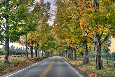
One of the first photos I've taken that interested me in making photography a hobby - and dumping more $$$s into equipment and software - is a photo of Route 381 running through Rolling Rock Farms in Pennsylvania. The original image was taken in October of 2009. At that time, I knew about the science of taking photos - but didn't know how to use it. So I have a good subject photo - with a blown sky. The all around image is good, but there are two elements of the photo that keep it from being great.
The original image:

1/60 f/5.6
Aperture Priority
ISO 200
Focal Length 32mm
Focal Length (35 mm) 48 mm
At least the trees are relatively straight.
There are two issues with this photo, that is the sky is flat as can be and on the left side there is a layer of blown sky leaking to a row of trees.
In 2009, I started post-processing with HDR. I favored the grunge look. With that amount of alteration, the sky would look OK - or at least passable. This is the image I favored.

Heavy on the grunge and it did something to the sky. And so at the time, I liked it. I didn't know any better.
Times change. These days I'm favoring less of the grunge - but still the detail enhancement. And the software is getting so much better I should be able to do something with the sky.
So in the 2015 version of this image using Photomatix, instead of going grunge I went with one of the Painterly selections. To start with I am looking for help on everything but the sky. In order for this to work as I have envisioned - the sky will have to go. All of it.
This is what I now have after HDR to start with.

I still have the detail in the trees - but a little less saturation in the foliage. I usually like it a bit more detailed all around, but I can add it at the end.
I needed to find a sky - just a stock photo. Anything too blue wouldn't look right to me. so I was looking for a nice diffused sunrise or sunset. Not only was the sky important, but I have to sell the left row of trees. And this is what I found.

This helps on many levels. Not only does it have a nice dark gradient from top to bottom, but also right to left. It should sell the trees on the left. Adding this to the trees, this is what I get.
And finally I'll add back in some detail work. And I also darkend the road a bit, call that personal preference. So the final product will look like this:

I think the trees are a bit more color realistic than in the grunge version. The leaves lack a little saturation and I'm OK with that change. The sky is a big improvement and fits quite well.
A little history of where I started - taking something straight out of the HDR process pre-sets to actually trying to improve on it a bit.
The original image:

1/60 f/5.6
Aperture Priority
ISO 200
Focal Length 32mm
Focal Length (35 mm) 48 mm
At least the trees are relatively straight.
There are two issues with this photo, that is the sky is flat as can be and on the left side there is a layer of blown sky leaking to a row of trees.
In 2009, I started post-processing with HDR. I favored the grunge look. With that amount of alteration, the sky would look OK - or at least passable. This is the image I favored.

Heavy on the grunge and it did something to the sky. And so at the time, I liked it. I didn't know any better.
Times change. These days I'm favoring less of the grunge - but still the detail enhancement. And the software is getting so much better I should be able to do something with the sky.
So in the 2015 version of this image using Photomatix, instead of going grunge I went with one of the Painterly selections. To start with I am looking for help on everything but the sky. In order for this to work as I have envisioned - the sky will have to go. All of it.
This is what I now have after HDR to start with.

I still have the detail in the trees - but a little less saturation in the foliage. I usually like it a bit more detailed all around, but I can add it at the end.
I needed to find a sky - just a stock photo. Anything too blue wouldn't look right to me. so I was looking for a nice diffused sunrise or sunset. Not only was the sky important, but I have to sell the left row of trees. And this is what I found.

This helps on many levels. Not only does it have a nice dark gradient from top to bottom, but also right to left. It should sell the trees on the left. Adding this to the trees, this is what I get.

And finally I'll add back in some detail work. And I also darkend the road a bit, call that personal preference. So the final product will look like this:

I think the trees are a bit more color realistic than in the grunge version. The leaves lack a little saturation and I'm OK with that change. The sky is a big improvement and fits quite well.
A little history of where I started - taking something straight out of the HDR process pre-sets to actually trying to improve on it a bit.
Subscribe to:
Posts (Atom)